Introducing ComputerTalk's rebrand
by Erina Suzuki | Published On January 7, 2024

In a world that's constantly evolving, so are we. We're kicking off the new year with a rebrand, and we're super excited to share what’s new!
Our rebrand isn’t just a change in appearance; it's a reaffirmation of our commitment to our values. Each color in our new logo represents a core value that defines us – trustworthiness, innovation, friendliness, collaboration. This rebrand has been made possible by the incredible dedication of our employees, clients, and partners, who have helped shape ComputerTalk into what it is today.
Before we get into the details, you might be wondering: why did we rebrand?
There were two key factors that motivated this change:
- To align our product logo and company logo
- To modernize our company logo to reflect the values we uphold at ComputerTalk
Better alignment of our two logos
A crucial element of our rebranding initiative is to establish a cohesive alignment of our company logo and our product logo to foster a cohesive brand identity when someone identifies our Company and/or our solution, ice.

Modernized logo
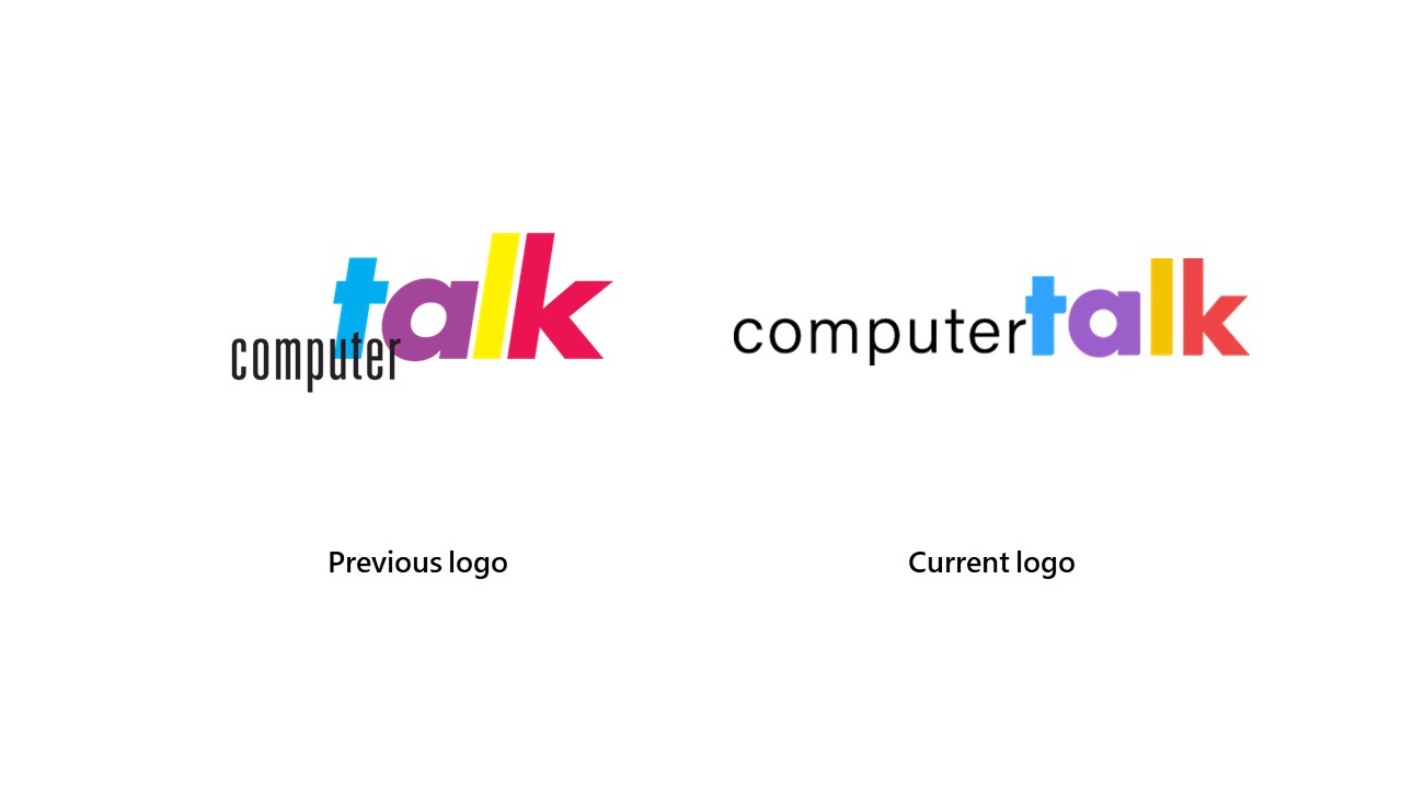
ComputerTalk’s mission is to deliver reliable, innovative communication solutions that inspire trusting, collaborative, friendly, and lasting relationships. While our old logo conveyed this mission, a modern touch was needed to reflect our core values. Below, see our old logos, which have been improved on in our rebranding initiative.
Let's take a closer look at the changes we've made...

The typeface + font
To modernize the logo, we unitalicized the ‘Talk’ and adjusted the typeface of 'Computer' to mirror the style in our ice Contact Center logo. These changes were carefully considered to enhance the visual representation of our brand and ensure a cohesive identity.
The colors
We changed the pink "K" to red to align with our ice Contact Center logo, allowing the distinctive ice red to harmonize with our company logo. The blue color was also updated to reflect the blue used within our ice platforms. Additionally, subtle adjustments were made to the purple and yellow tones to create a unified and modern color palette.
The placement
In the previous logo, 'Computer' was overlayed onto 'Talk'. In our current logo, we positioned 'Computer' alongside 'Talk' to enhance the visibility of the logo and modernize the look.
Unveiling ComputerTalk’s rebrand
We have gathered insights from our clients and staff regarding the keywords that come to mind when they think about ComputerTalk. The top four values most strongly associated with ComputerTalk are trustworthiness, innovation, friendliness, and collaboration. These core values are represented by the colors blue, purple, yellow, and red. Continue reading to learn more about our values.

Trustworthiness
With over 35 years in the industry, trust has been the foundation of our brand. Blue is a color often associated with stability, reliability, and, most importantly, trustworthiness. We commit to a trusting relationship with our customers and partners.
Innovation
Our ice Contact Center solution is constantly evolving and is an industry leader in the Microsoft Teams contact center space. One of the key drivers behind our solution is our commitment to innovation. That’s why purple is one of our colors; it is often associated with innovation and creativity — perfectly aligning with our core value of pushing boundaries and our dedication to exploring new possibilities.
Friendliness
The color yellow represents friendliness, as it radiates warmth, positivity, and approachability, reflecting our culture at ComputerTalk. When we asked our clients about what they thought of us, the feedback was overwhelmingly positive. Our customers have expressed their appreciation of our friendly service, easygoing approach, and quick, effective responses.
Collaboration
The saying "Teamwork makes the dream work" may be a bit cliché, but it's undeniably true at ComputerTalk. Whether we're collaborating among our teams or engaging with our clients and partners, our commitment to working together towards shared objectives remains constant. The color red represents passion, courage, and collaborative spirit, and that's precisely why it's incorporated into our branding colors. We don't just provide contact center services; we serve as an extension of your team.
We've achieved significant milestones and innovations that further exemplify our dedication to providing enterprise-class contact center solutions to our customers and strategic partners.
Some of these achievements include being ranked #1 in multiple categories by Software Reviews; the general availability of ice 12, which introduced enhancements that elevate the standard of customer service within our offerings; and the valuable partnerships we’ve made along the way.
As we embrace this exciting chapter, ComputerTalk reaffirms its commitment to being a trustworthy, innovative, friendly, and collaborative solution provider. Part of our rebranding represents our pledge to continue exceeding expectations.
Click here to learn more about our all-in-one customer service platform, ice Contact Center.
More from our blog
 Learn how to handle call spikes without sacrificing customer experience. This guide shares 10 proven strategies to manage high call volume, improve forecasting, and keep your team ready for potential surges.
 When you think of contact centers, you might just think of agents answering customers’ questions about products or services. While this is one common use case for contact centers, that’s not all they do.
 Great customer service is important to any business. Naturally, that means that the contact center you use for customer service is an important decision to make.


